Towards a Theory of Parserless Parser Interfaces
With the release of Vorple for Glulx, now is a great time to think about what I’m calling parseless parser games: Text games that use the world model and mechanical tradition of parser games, but don’t actually have a parser interface. The most prominent recent example would be Robin Johnson’s Detectiveland.
This is sort of a theoretical exploration of how to build interfaces to interact with the traditional parser world model (rooms, point of view character, and of course “medium-sized dry goods” as interactive objects). Most of this involves looking at the history of graphical adventure games, which diverged pretty directly from parser interfaces and into point-and-click ones. I’m trying to produce a taxonomy of how those interfaces operate and what their pros and cons are, for people who are looking at building on Vorple to produce extensions or games that use this sort of interaction.
We can split most common actions in parser games into three rough groups: Moving around, talking to NPCs, and manipulating objects. Currently, I think that last one is the most complicated, so let’s look at the other three first. Of course, all of those can be cut entirely from a given game; NPCs, particularly, are often not present.
Talking
NPC interactions are interesting in that there is no “standard” design in the parser canon; rather, there have been many different attempts and iterations. Other than the traditional opaque ASK/TELL interface, which is nowadays regarded as pretty obsolete, most of them fit very naturally to a hypertext interface: ASK/TELL with suggested topics and conversation branching in particular. So I’m leaving off talking about those for another day.
It is true, however, that hypertext lends itself to more constrained ways of interacting with NPCs, which may make them easier to implement. Because you can control tightly what options are available to the player through the interface at any given point in the story, you can avoid dealing with edge cases (such as ASK JERRY ABOUT MURDER when the PC shouldn’t be aware of the murder yet).
Moving about
Moving around is also interesting. Detectiveland implements the traditional cardinal direction movement system, where rooms are arranged in a grid. This works for that game specifically because of the use of a grid-shaped city map that the player is meant to navigate.
But a pretty obvious improvement for a lot of games would be to simply display a clickable list of adjacent rooms, making navigation very similar to Twines that use some kind of spatial world model or are based around movement in a space.
Objects, the disposition thereof
This is where things get complicated. and we depart from the usual way actions are constructed in a parser game.
Parser games, given that they were designed to emulate natural language processing (in English), use a verb-object-indirect-object interface based on action construction. The user is expected to pluck a verb out of the air and type it into a somewhat wobbly sentence such as “STICK THE DEFRACKULATOR INTO THE ZARDOZZING RECEPTACLE.” Some later iterations of this interface, like say the Sorcery 101 series, take away the “pluck something out of the air” aspect by offering comprehensive lists of verbs and nouns that the game recognizes at a given moment, which can be used to build commands.
This is the most naive version of a point-and-click adaptation of a parser interface: A comprehensive list of potential verbs plus a comprehensive list of nouns, and players use that to fill in commands.
Of course, that list would get pretty big if we wanted to include a “generalist” set of verbs, so maybe we would want some kind of search function for it; maybe the user could type in a few letters and get auto-completing suggestions. To make that search function even better, we could expand the list with multiple synonyms for a given actions, and… we’re back where we started. What you have is a parser game that’s still built around typed input but has more discoverability in the form of explicit verb/noun lists. This isn’t a great UI. Relevantly, it’s particularly bad on mobiles, though suggestion-based type-in interfaces might be worth investigating, similar to what the iOS release of Hadean Lands had. But that’s another blog post.
Otherwise, we need some kind of adaptation of the parser interface, one that is based on culling the choices available to the player.
Limiting the number of verbs


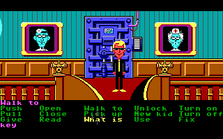
Starting from Maniac Mansion, LucasArts’ graphical adventures using the classic ScummVM interface were based around a grid of verbs that the player would choose from, then click on an object in the environment to construct an action.
Originally, this wasn’t really limiting the number of available verbs; the verb list is pretty much identical to the one available in the relatively limited parsers present in graphical adventure games with text input, like the original King’s Quest.
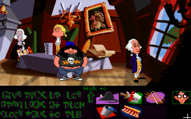
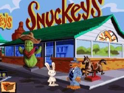
But as LucasArts iterated on this interface, the list of verbs was gradually culled. Eventually, in Sam and Max Hit the Road, it had been shortened so far that the lower third of the screen was freed up for showing more of the environment, and players would right-click to switch between a very basic set of verbs: use, take, talk to, examine.
Subverting the verb-object order
Detectiveland uses a noun-verb order; nouns are visible in a list in the interface, and potential actions to take with them are subordinated to the nouns, either as buttons present next to them (for objects in the player’s surroundings) or in a submenu that appears when an object is selected as the “active” object (for objects in the player’s inventory).
Later LucasArts games also moved in this direction; clicking on an object would cause a menu to pop out with icons for examining, taking it, or using it (or entering conversation with an NPC). In a graphical game, this privileges the view of the gameworld over UI elements. In a game like Detectiveland, this is a good solution for discoverability; players are naturally asked to think about what they want to interact with, and then led into interactions with those objects.
The object-object interface

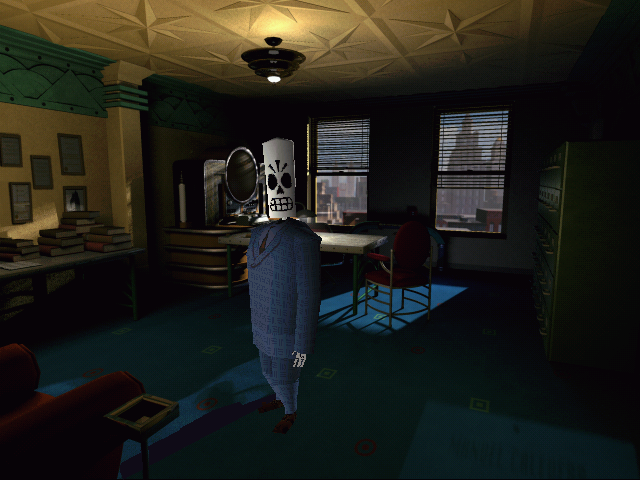
LucasArts’ last adventure game, Grim Fandango, was a 3D game designed around keyboard input instead of mouse input. A 3D player character would move around pre-rendered environments, controlled by the keyboard (originally, using “tank controls”). As he comes close to objects in the environment, his attention is caught on them, indicated to the player by his head turning to look at them; keyboard buttons can be pressed to examine, take, or use those objects. The PC can hold an object in his hands, and this “active” object is what he’ll try to “use with” whatever he’s looking at.
This UI was actually really bad and in most ways worse than a point-and-click interface (so much so that Grim Fandango remastered includes a point-and-click mode), but it highlights the basic endpoint of adventure game UI evolution, the one that is shared with other more recent graphical adventures such as Dreamfall or Syberia: It’s about rubbing objects on other objects. The player’s main point of discovery is finding which combination of objects will solve a given puzzle.
This interface doesn’t necessitate the overwhelming use of simple lock-key puzzle design, but it kind of encourages it, and it often makes puzzles that are more complex than that feel like lock-key puzzles, particularly if the player doesn’t fully understand them. And, because it encourages the player to lawnmower (the old “rubbing everything on everything else” trick), it’s easy for players to get into a situation where they solve an obtuse puzzle but don’t understand why.
Detectiveland uses a variant of this interface convention, where options for interacting with objects in the environment may be influenced by what inventory item the player has “active” at a given moment.
The Lone Object interface
I’d be remiss if I didn’t mention the simplest and cleanest iteration of all this. This is the UI convention used in games like Samorost. You click on a thing to interact with it. Puzzles emerge out of clicking on the right things in the right order, usually by observing the consequences of each interaction until you figure out how to unlock the sequence that does what you want. The Myst games also essentially use a version of this interface.
This seems simplistic, but it can be surprisingly deep. It pushes towards games that are about manipulating machines or systems, however, and it also leads to a degree of puzzle siloing; there’s no good way to force puzzles to interact with one another except through player knowledge (Once unlocked, puzzle A gives you information you need to solve puzzle B) or by making an entire single puzzle into a toggle that feeds into another puzzle (You need to turn on the generator in the basement before the odd machine in the kitchen will work). I do think it lends itself more to visuals than to text, however; I can’t imagine Text Myst would be much fun: “You see a machine. On the machine are six knobs, ten buttons, and four levers.”
Action construction versus action suggestion
All of those interfaces we’ve looked at so far are what I would call constructive interfaces; the player assembles an action by picking out its elements: two objects to use together, or a verb and an object.
But there’s another approach lurking in the wings: Suggesting fully-formed actions to the player, and letting them pick one out. The most obvious case of this is with movement, as described above; instead of giving the player buttons for cardinal directions, give them only the directions they can actually go. But it could also be used to suggest all of the player’s interactions with the game.
This can be used to build games with deep world models that present an interface much more similar to choice-based or Twine works. It can also be used to scope a project down significantly, depending on how actions are suggested. Specific valid actions could be chosen by hand, essentially overlaying a choice-based limitation onto the base world model of a parser game. Or, they could be figured out programmatically; an example approach would be figuring out all of the actions the player has available to them (from a given set of verbs and visible objects) and then culling that down to the ones that make sense, and then perhaps further refining it by sorting it by relevance or salience somehow. That’s a significant, difficult problem to solve, but it’s not impossible.
But the underlying game doesn’t have to be a traditional branching narrative. You could write, for example, a roguelike in the vein of Kerkerkruip that suggests actions for the player based a certain set of priorities and rules. For example, if a monster is present, you might have the option to attack it, use a magic item, or flee. If a monster is not present, inventory management opens up and you may have the option to pick up/drop things, or move in any direction. Contextually culling options can be used for effect as well as to keep the interface’s profusion of options manageable for players.
Using the text scroll as an UI
A thing to note here is that while Detectiveland uses a separate UI panel for controls, it doesn’t have to be so. Links present in the main text can be the main way players interact with objects. Some exterior interface might still be needed for actions such as looking around or moving, which aren’t contextual to a particular object, but otherwise you could just let the UI elements that reference objects just be the text that reference those objects; think of the blue highlighting in Blue Lacuna, but with each highlighted noun being a clickable UI element that expands to show potential verbs. This is an advantage of an object-first interface that Detectiveland actually doesn’t use.
Hybrids; using suggestions and culling to extend constructive interfaces
The problem with constructive interfaces that have a lot of verbs is that they’re overwhelming and don’t seem much better than just a text parser with a visible verb/noun list.
The problem with constructive interfaces that have a very limited verb list or no verb list is that they are susceptible to lawnmowering, and it’s easier for players to solve a puzzle without actually understanding it, leading to an unsatisfying sensation of thinking the game doesn’t really make much sense.
A good compromise between those two is to use a verb list that is short, but not completely minimal. An even better one is to use a verb list that is somewhat longer and contextually cull available verbs based on context. What if “INSERT” was present only if there was a container around to insert a thing into? Detectiveland essentially does some of this, though it can be expanded to include, for example, somewhat obscure verbs and to make use of the “active object” convention. What if you had the option to record sound from objects when you’re holding the audio recorder, but you can also put the recorder into a container, and the recorder is also a device, so that turning it on is an action that’s always available with it?
Suddenly a complicated puzzle like “put the audio recorder in the cigar box, close it, and walk out so you get a recording of Jerry’s conversation with Jane, then bring it to Roger’s office and leave it where Roger will find it later” becomes possible to express, while surfacing all those options to the player without making the overall volume of options overwhelming.
Vorple for Glulx is a major development that breathes new life into Inform, and I hope this is helpful to people who are trying to figure out what you can do with it; there’s a wide range of possible UI and design choices you can make just within the realm of traditional adventure game design, but this is nowhere near the entirety of the possibilities that it opens up.